Tuesday, November 6, 2012

Campaign Mailers

We here at GHPALS are all registered as decline to state voters as our political leanings are no one's business. One consequence of that desire for privacy is we get the flyers from everyone.

So far we've received 80 mailers, more than the last big election 2 years ago. Of course, it helps that Costa Mesa has a proposed charter on the ballot, and out of city money is pouring into town to fund one side or the other. 

We are not here to talk politics. That's strictly verboten at society gatherings. But these mailers are literature in every sense of the word. They are designed to grab one's attention, to touch one's emotions, to persuade one to a certain point of view, as many writers attempt to do with their work. And they definitely reflect the society around us, as much literature does.

For statistical purposes, the mailers were sorted as follows:
  • 17 Vote NO on Measure V
  •   4 Vote YES on Measure V
  • 23 Support one or more Costa Mesa city council candidates
  •   7 Support one or more candidates for other local governments in town (water or san district)
  •   4 Vote YES on Measure M (bonds for the local community college district)
  • 16 Support Yes or No on one or more state-wide propositions
  •   9 slate mailers
Our hands-down favorites were the slate mailers. From what we've read, enterprising printers approach candidates and get them to contribute money to have their names endorsed in the mailer. Those paying to be in the mailers are marked with an asterix (*) under state laws (or maybe it's regulations.) But the printer can add other candidates or positions to fill out the space.

This makes for really interesting combinations. For example, Sandy Genis, Costa Mesa City Council candidate supported by labor unions, appears in 2 paid flyers alongside YES on 32 paid positions. She is not marked with an asterisk in these, indicating her campaign did not pay to appear in it. These two flyers are the "California Public Safety Newsletter and Voter Guide" and the Woman's Voice Newsletter. She paid to appear in two other paid slates, and one of them has NO on 32 (its supporters also paid for it to be on the slate.) All the slates with her name in it do say NO on Measure V.

The Cops Voter Guide was another hoot. It purports to support public safety, and those paying to appear in it include the 3-M's (McCarthy, Mesinger & Mathews). Two of these candidates (McCarthy & Mesinger) sent out a flyer "Meet Costa Mesa's $200,000 Club" that says "Costa Mesa's police officers are the highest paid officers in Orange County…"

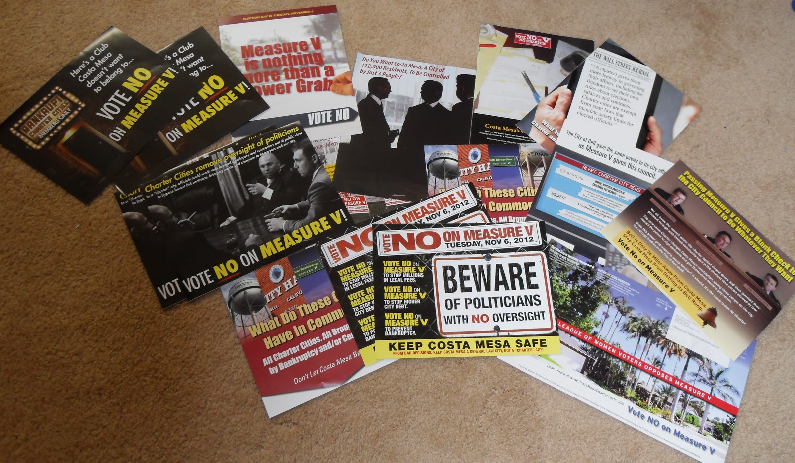
By far the largest collection of mailers opposed the proposed Costa Mesa City Charter (see the picture to the left.) All were incredibly negative and seemed to be funded by labor unions.

There were 4 pro-V flyers, and these focused on the goals of the charter. We at the Society did not discuss the charter, only the flyers.

We got a good laugh from the photos that appear on some of them. Often they are meant to convey one message, but really send another. Like this one, funded by labor unions. It's supposed to make you think about politicians in smoke-filled rooms, but there isn't anything to make it clear the men are politicians. They might well be labor union officials. There's been as many scandals about them in the papers as there have politicians. Of course, the inside of this flyer makes the point stridently, as there's a big picture of the former City Manager of Bell in handcuffs, surrounded by police officers.

The Yes on V people used a more effective image, we thought. A simple graphic that shows a determined, focused individual ready to fight back.

And they had what we thought was the most effective graphic of all. A simple sign in a yard, indicating support by people in the community.

Another photo that amused us was on the flyer for Don Harper and Jeff Mathews, candidates for the Costa Mesa Sanitary District. The words on the flyer indicate the graphic is supposed to illustrate a close relationship between incumbent directors and the company that hauls the trash. But if you didn't read the stuff (and let's be real, who does?) you might think the photo is Harper and Mathews, and that they are really good golf buddies. But if you turn the mailer over, you find their photos, and they don't look anything like the guys playing golf. But since the mailer is huge, 11" by 14", and the address label is on the golf side, most people wouldn't even open it to see who the mailer is promoting.

Digging through the pile, we spotted another mailer that effectively conveyed its message: Vote NO on the Charter and vote for Stephens/Weitzburg/Genis slate. The message is very clear.

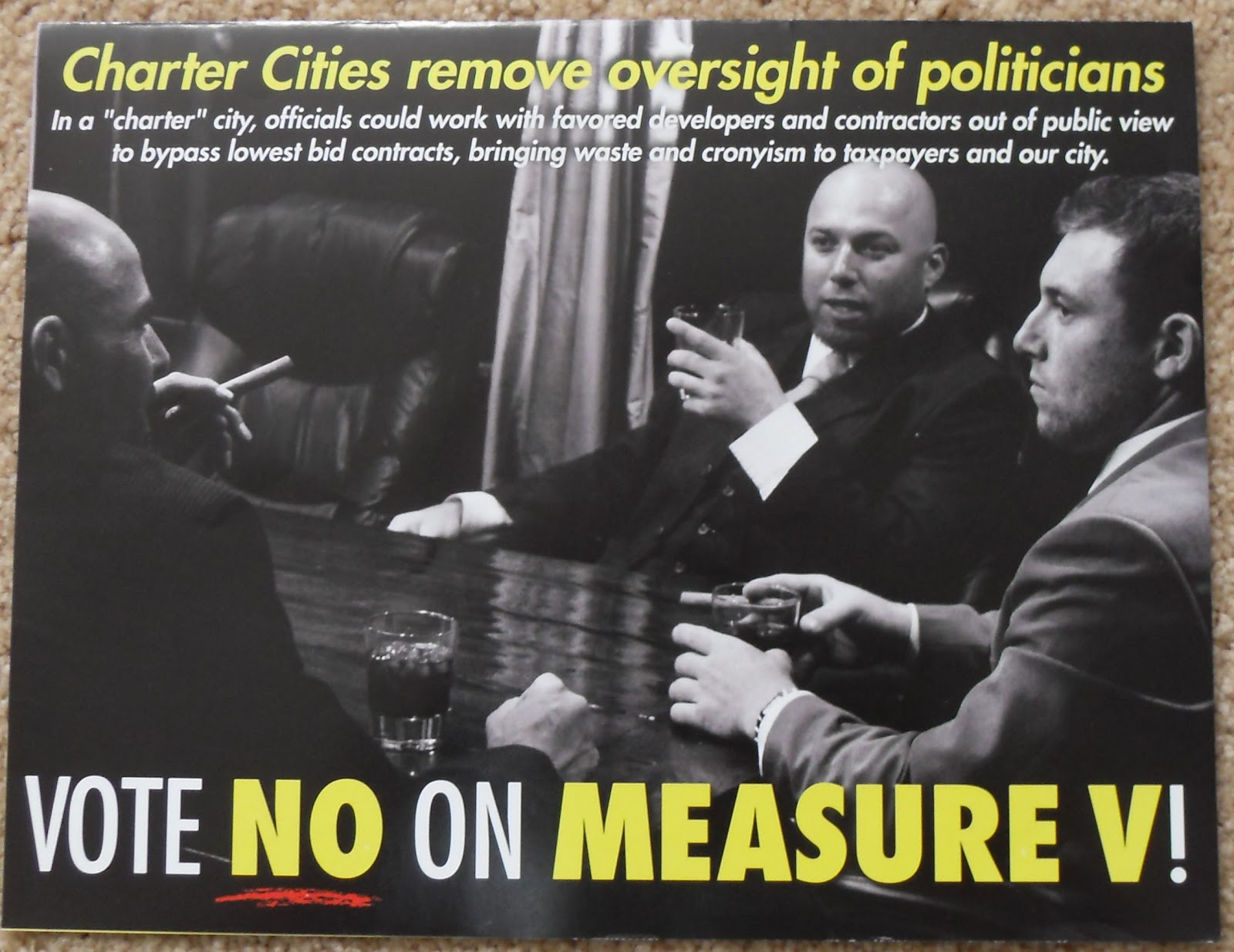
But underneath it was this one, and immediately the movie Scarface came to mind. Does the guy on the right have a prescription for that joint? And this one wasn't paid for by the candidate who supported medical marijuana dispensaries in town.

We all chose our personal favorites. Some of them have already been discussed, and we don't have room for them all. But we will mention a few that seem notable for one reason or another.

One member liked the simple letter from Colin McCarthy that had no pictures, came in an envelope like real letters do, and explained why he was running for city council and what he hoped to accomplish. The recipient of this letter said he actually read it.

Another liked the Costa Mesa Trivia Challenge that posed questions like "Which candidate tried to kill 2,500 high paying jobs in Costa Mesa?" and "What is the average annual compensation for Costa Mesa's city employees?" Who can resist a quiz?

Yet another member liked this one on Proposition 38 since it said how much money would go to schools in our area if the proposition passed. We all recognized the schools: Whittier Elementary, Wilson Elementary and Estancia High. But we laughed like crazy when the member who got this flyer pointed out that these schools were all on the west side of town and she lived on the east side. Whoever sent out these flyers didn't personalize them very effectively. We wanted to know how much Kaiser or Mariners Elementary would get.

And the last one we agreed we'd post on the blog was a simple, effective means of conveying information about Proposition 37 through a comparison chart. The graphics were clear and attractive.

GHPALS finds the art in everything, and encourages you to do the same.

Saturday, November 3, 2012

The Art of Campaign Signs

If you've seen someone driving around town taking photos of campaign signs, it isn't someone scouting for signs to steal, it's GHPALS members. We don't talk politics at our gatherings, but we recently became interested in the artistic merits of campaign materials and decided to review them like one would art displayed in a gallery. So we took pictures of signs around town, never leaving our cars, and cropped the photos so no one can tell where we found the signs.

Often the signs are grouped together, like the scene below. Usually there isn't much thought given to  aesthetics. If we were arranging the signs, we would have put Mensinger and McCarthy together, put Harper/Mathews to the right on Yes on V, and left Fisler at the end. We'd have put more space between them too. But the central focus of this grouping is YES ON V. We wonder if it was intended to be.


In looking at campaign signs we considered color, line, font and letter case.   The color needs to catch your eye and draw you in to read the letters. The line needs to put those words in the most effective order, usually by putting the important ones in big letters across the middle. The fonts and case chosen can impact the readability of the sign.

The signs we thought the ugliest, and the prettiest, were for Costa Mesa Sanitary District incumbents Ferryman and Perry. We really liked the colors by themselves because they look pretty together. But  these blues are absolutely wrong for the signs. Too hard to read from a distance and impossible in the dark. But Mr. Perry's bold blocky letters have the edge because they are in a lighter color.


Far more effective and attractive is this one for Fred Bockmiller, another incumbent, but for Mesa Consolidated Water District, the providers of clean water to Costa Mesa (the Sanitary District deals with it after it goes down our drains). You can tell immediately who he is, BOCKMILLER, and that he's a candidate for  WATER DISTRICT. The two lines across the sign compliment each other and the sign has real symmetry. Too bad there aren't more of these signs so we could get a better picture; this one's kind of fuzzy.

Blue is the most common color used, and is commonly paired with white or red. But another water district director chose an unusual pairing, almost neon green. Most of us here at GHPALS have no idea what the Municipal Water District is, but after seeing this sign we'd look for her name on the ballot. You remember it because the sign looks so different, though it took us a while to figure out those were water drops and not Christmas ornaments. And the checkmark is just distracting. But the font is nice and clear, very easy to read.


Another water candidate has a confusing sign. The yellow does stand out so we would remember the name. We get that he's an incumbent from the word Re-Elect. But we can't find "Mesa Water Board" on our sample ballot. We found him in the Mesa Consolidated Water District candidates. Bad wording. Bockmiller's sign is far better. The viewer can't help wonder if the guy can't get the name of the place right, why should I vote for him to be on it?

Someone named Worthington is also running for a Water Board, but you can't tell from his sign which one. At least Fisler tells you it's Mesa. Worthington's sign is one of the few that doesn't use any blue, and the shape of his sign makes his name stand out. But the sign looks recycled, like he ran for something else another time, and "Director", and "Water Board", are pasted on over something else. We finally found him in the sample ballots under Mesa Consolidated Water District. He should have stuck to all caps, and we would have put the word "elect" over the "i" in Worthington, replacing the dot.


 The last two candidates for Mesa Consolidated Water District both use blue and white as their central color scheme. Ms Ohlig-Hall adds a dash of red, but from a distance you can't read it says "Re-Elect". Nor can you tell that she's running for what water district she's running for, Mesa or the Municipal Water District. But you can clearly read her sign on Fairview Drive at the 405 from across that wide street. Mr. Temianka's signs are not as clear from a distance; he should have used a bolder font and darker blue. The font isn't right either.

But the majority of signs are for the big issue facing Costa Mesa, approving the draft charter or not. Do we stay a general law city or go off on our own. And the campaigns for City Council divide the candidates into two camps: those that favor the charter and the ones that don't.


Looking at the Yes on the charter candidates first, the most common sign is the 3-M, Yes on V sign. It's orange letters on blue, with that striking white dividing line make it crystal clear this slate of candidates favors the charter and is running as a block.

We found many campaign signs for Colin McCarthy and Steve Mensinger, but none for Gary Monahan. Maybe because the last is a well-known person about town. His name is in the middle on the 3-M sign, like the filling on a sandwich.
Colin McCarthy's blah, but reasonably effective sign makes good use of white letters on a blue background. Highly legible when a car's headlights hit it at night.

Steve Mensinger's is also effective. We liked the read pennant at the top; it makes us remember his first name. Though it is also distracting. We'll remember his first name before his last one. His signs are not all alike. Some of them use a lighter blue.

Three of the anti-charter candidates are also running as a block, and the white lettering on dark blue does make their names stand out. Their signs do not make their position clear on the charter, which is a bit deceptive given their campaign literature (but that's the subject of another post).

We didn't see any signs for Mr. Weitzberg, though there probably are some out there. We did find signs for Sandy Genis and John Stephens. Hers are clear and easy to read, though her first name stands out more than her last name. Those rectangles of dark blue with white lettering draw the eye away from the central message, her last name.

Jon Stephens signs are just plain ugly. That almost neon red almost makes one cringe. The tendency is to turn away from it, not to look at it. And his name fades into the distance because the blue font looks washed out. And what is with that star? Is he running for marshal?
His name should be all uppercase, maybe in white. The Facebook log leaps out at you, while the name is lost.


Whoever designed the Vote No on V signs did a good job. The white letters on the dark red background really stand out. You can easily read it across a wide street. The font has serifs, and in this case it is a bit distracting.


The statewide propositions get some attention too. While we could not get a photo of the Yes on 37 signs that are all over Mother's Market on 19th and Newport, they are similar to the Yes on 35 signs. Light blue and orange. Attractive, but not easy to read at night.

A lot of money is being spent by both the Yes and No sides of Prop 32, but not much on signs in Costa Mesa. We found one Yes sign, and it is a pretty boring blue and white one. It makes the point but unless you get up really close, you'd have no idea what Prop 32 is all about. But then again, you hear so much about it on TV and radio that you can't help knowing. So why waste all that space on the sign? Just make it read "YES on 32."

The sign for "emken for U.S. Senate" was an odd one, in our opinions. Why did this candidate put their name in lowercase letters? It's demeaning, distracting and ugly.

Allan Mansoor's sign is better. You can easily read his name and what he is running for. That's what a sign is supposed to do. Though we might not have picked the baby blue. It gets washed out by the California sun pretty quickly.


The last two signs we spotted was unusual, and wasted. Why did someone put this sign at the far western end of 19th street, just before the river? Costa Mesa is served by Newport Mesa Unified School District, not Santa Ana's.